AVIATION GLOBAL CARBON EMISSIONS
ABSTRACT
The CO2 impact of planes
Talking about being "eco responsible" is the trend. We are told by newspapers, scientists, social medias and Greta that we should consume less, or at least make efforts. Since in our team, we are true students, we were already talking about the next summer holidays. In the middle of the discussion, we suddenly became worried about a particular aspect of the holidays.
This is why, for this research, we decided to focus on planes. Indeed, planes are subject to more and more taxes, and are criticized for being extra pollutant. But is it really true ? In our analysis, we computed and measured different metrics related to CO2 emissions of airplanes and airlines. The outcome should help us to be aware of the impact of our travel decisions. For example: "Does the choice of the airline company have an impact on my carbon footprint?".
Before jumping right into our analysis, let us take the time to explain to you how we started. The first thing that we needed was information about different existing aircraft models and their characteristics, and we luckily found this wikipedia page. We parsed it (we spare you the details beacause you are here to read a story, not a user manual) and added a crucial missing information: the CO2 emissions in kg/100km as well as the CO2 emissions in kg/100km per seat, for every aircraft model.
Briefly, we added these fields thanks to one of our team member chemestry memories from high school (if you REALLY feel like we are missing some details, look at this).
To be able to fully understand our beautiful story, you will still need a few informations about the data we worked with (hang on, we are almost there). The aircraft are classified in five different categories : commuter, regional, short haul, medium haul, long haul.
Each category corresponds to a specific sector size. The sector of an aircraft is its maximum range without re-fueling. Here is a table showing the sector size associated to each category of aircraft:
| Commuter |
560km |
| Regional |
926 - 1267km |
| Short haul |
1900km |
| Medium haul |
3240 - 6300km |
| Long haul |
8610 - 13330km |
Also, we will be talking a lot about “pollution”. For the sake of this analysis, we will consider that “polluting more or less” means that more or less kilogram of CO2 is emitted per passenger for every 100km that he/she flies.
On a first sight, with a short simple preliminary analysis, short haul aircraft seem to pollute a little bit less. Our hypothesis is that short haul flights have less material to carry around. For example, on short haul flights, a fewer bathrooms on board might be sufficient, while long haul flights are operated by aircraft that have two aisles, more bathrooms and are usually a three classes configuration. Furthermore, depending on the destination, long haul aircraft are equipped with life rafts, and other emergency equipment that is not required to be carried on board of short haul flights. People traveling long distances also tend to pack more, making their luggage and the aircraft heavier. Finally, long haul aircraft need to carry more fuel for longer distance flights.
But this is only an observation based on the mean carbon emissions per seat for each category of aircraft. Let’s then dig a little bit further: buckle up and enjoy the journey !
CHAPTER 1
Size matters
The first thing that interested us was to see if there is a relation between the CO2 emissions of an aircraft and its sector size. Obviously, if we simply look at the the mean CO2 emissions in kg/km, the results will be biased. Why ? Well, look at this:
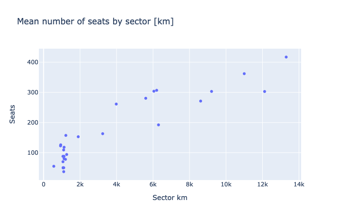
Indeed, the bigger the distance is, the more seats the plane has (because, as said before, it is also a bigger plane). What would be more interesting, would be to plot the CO2 emissions relatively to the number of seats, and that’s what we have done here:
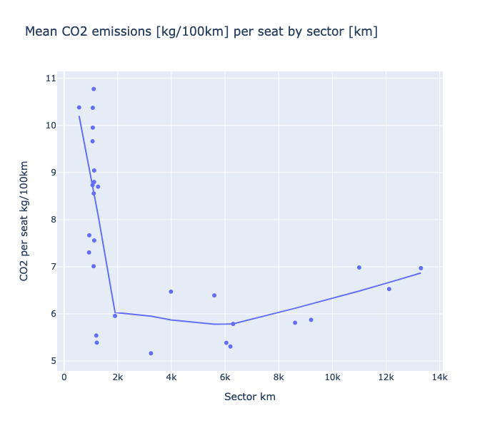
With this graph, we can see that most of the flights shorter than approximately 2000km pollute a lot. Also, emissions seem to reduce until 6000km, and then slowly start to grow. We think that this growth is due to the extra fuel needed for longer flights.
So far, we can already conclude that if we are looking for an “ideal distance” to travel, it should be more than 2000km and less than, let’s say, 8000km (since even if it goes up from 6000km, it stays reasonable until 8000km). But now we may want to understand why. What you saw up here were the mean emissions. Plotting all the data and not only the means will help us to understand what is happening.
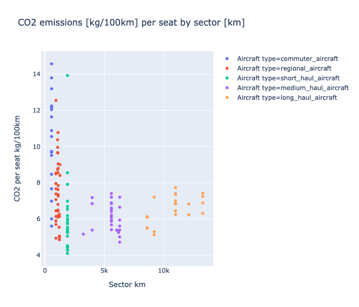
Indeed, regional and commuter aircraft are messy. Also, one short haul aircraft is an outlier: it is a Quest Kodiak, a plane with only 9 seats which explain its CO2 emissions.
About regional and commuter aircraft, some models have very few seats as well, for short distances. This has a direct impact on the CO2 emissions per seat and explain why our graph is so messy.
If you think the same way as we do, you would appreciate to see the relation between CO2 emission per seat and the number of seats of an aircraft. Well, please, be our guest and look at this:
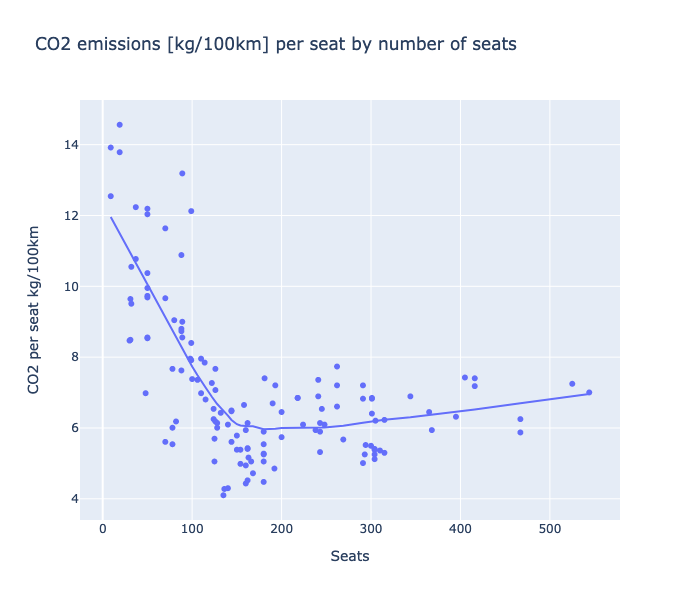
We can obviously see a global trend. Emissions goes drastically down until 200 seats, and then goes slightly up again. This curve looks a lot like the one we found when looking at the relation between CO2 emission per seat by sector size. This confirms the relation between the sector size and the number of seats.
Let’s wrap up what we got so far:
- aircraft that travel longer distances have usually more seats
- aircraft with sector size between 2000km and 6000km pollute less in terms of CO2 emission per seat
- aircraft with few seats tend to have bigger CO2 emissions per seat
One aspect that we did not take into account is the build date of the aircraft. Indeed, we could hope that more recent planes are more efficient in terms of carbon emissions. But instead of hoping, let’s find out !
EVOLUTION OF CARBON EMISSIONS THROUGH THE YEARS
In our data, we have access to the year of the first flight of each plane. For the sake of this analysis, we will consider that an aircraft with a recent first flight year, is a recent aircraft. Since we want to have a global insight, we will look at a simple linear regression for every type of aircraft.
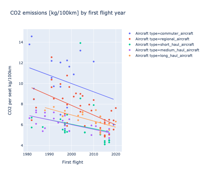
This is reassuring. For every category, planes are becoming more fuel efficient. However, there is a noticeable difference between categories. While short haul aircraft are decreasing from 4.3% per year, regional aircraft are decreasing from more than 9% a year.
With this analysis, we found an “ideal” distance to travel: more than 2000km. Longer distances (over 8000km) pollute more, but we think that travelling with stop overs is not a solution because it would probably increase the total travel distance.
Comparing the CO2 emissions of the aviation industry with cars, aviation remains a more ecological way of transportation when traveling alone. In 2020, newly registered cars need to have an on-average CO2 production lower than 9.5 kg/100km. Currently, the limit is 13kg/100km.
(reference: https://www.bfe.admin.ch/bfe/fr/home/efficacite/mobilite/prescriptions-concernant-les-emissions-de-co2-des-voitures-de-to.html)
2000km - 8000km
Ideal travel distance
7.14 kg/100km
Average CO2 emissions per seat of all aircraft
9.45%
CO2 emissions per seat decrease per year for regional aircraft
CHAPTER 2
The chosen one
Now that we have a good understanding of the relation between distance and carbon emissions, we would like to identify what type of traffic is the most polluting. We are also interested in finding the factors, if any, that make some airlines less pollutant than others.
For this part, we will need to get our hands on the fleets of each airline in details. To do that, we obviously need a dataset containing informations about airlines and their fleets. Well thanks to planespotter.net, we have all the informations that we need, and even more. They nicely agreed to share their data with us for research purposes only, and we would like to thank them again for that.
Since you are probably curious, here is a short parenthesis about one issue was that we encountered when merging all the data that we had. Some aircraft of the same model can be equipped with different number of seats. This means that the overall mass of the aircraft is slightly different and it leads to a slight difference in fuel burn / km. Since we needed to have unique aircraft models (otherwise we would not know which version of a given model to take into account), we solved this issue by grouping the all the same aircraft models together and averaging their values (i.e. a mean). Once it was done, we had a huge dataset with a lot of informations in it.
Now that you know the story behind our data, let’s have a look at what we are interested in, starting with the trends per operator.
The criterias of the fleet of aircraft that we are interested in are:
        Status = Active (in operation)
        Config = Pax (passenger)
        Operator Category = Airline, Leasing Company, Business Airline
You may be wondering why we are considering three operator categories, given that airlines are our main focus. Well, given how often Airlines lease aircraft to operate their flights, considering leasing company will allow us to include another large player in the passenger transport industry. To give an example of large airlines leasing flights, we can cite the example of Norwegian. During the summer 2018, Norwegian saw part of its Boeing 787 fleet grounded due to issues with their high-bypass turbofan engine, the “Rolls Royce Trent 1000”. To still be able to operate flights from London to New York, Norwegian used wet leasing from High Fly with A380 aircraft.
Wet leasing is a lot different than leasing, because the leasing company provides crew, pilots, maintenance, fuel, service, and even aircraft certification.
In addition to this, including business airlines will allow us to consider more of the private sector of private jets.
Talking about aircraft types, we had a look at the Combi aircraft type. For those of you that are not aviation experts, here is the definition from Wikipedia of a Combi aircraft :
“Combi aircraft in commercial aviation are aircraft that can be used to carry either passengers, as an airliner, or cargo as a freighter, and may have a partition in the aircraft cabin to allow both uses at the same time in a mixed passenger/freight combination.”
In our dataset, very few aircraft are flying a Combi setup. Amongst those aircraft, almost half of them belong to the air force. We decided to not consider them since they are too few to be of any impact in our analysis.
Let’s look at the largest airlines in the world
We want to look only at the “big” airlines. Let’s say that a big airline has at least 30 aircraft in its fleet. 30 is an arbitrary number that narrow down all of our airlines from almost 2000 to approximately 200. We thought that keeping 10% of all of our airlines for this analysis was a reasonable choice, and this explains the choice of “30”. Looking at small companies is out of the scope of this analysis.
Now that we have selected our big airlines, let’s look at their individual average CO2 production.
If you look closely, you will see that some company names are very similar. Here is the trick : most of these airlines are subsidiaries of larger airlines and are the regional operators. For example, Lufthansa CityLine is a company that belongs entirely to Lufthansa and operates flights on their behalf. More precisely, most of Lufthansa CityLine fleet are Bombardier CRJ-900. The CRJ-900 is a regional jet developed by Bombardier that entered service in 2001.
Pro tip: Aviation geek jargon “A regional jet (RJ) is a jet airliner and a regional airliner with less than 100 seats.” (source: wikipedia)
From what we saw on this graph, a new “arbitrary” number came to our minds: 8. 8 is the threshold that we chose, that corresponds to the mean CO2/100km emission per seat above which an airline is considered to be a big polluter.
That being said, let’s look at what aircraft are mostly flown by the airlines from our big polluter list.
Apparently, airlines that pollute a lot per passenger (still CO2 kg/100km) are mostly operating Bombardier CRJ (Canadair Regional Jet) or Embraer ERJ (Embraer Regional Jet). These are aircraft that were designed at the turn of the century and that are not engineered to fly long distances. And if we look look closely at these mostly used aircraft:
We can see that most of the aircraft that pollute a lot are used for regional flights. The worst aircraft with regards to pollution are the Bombardier CRJ-200 and CRJ-100. The picture below is one of a CRJ-200.
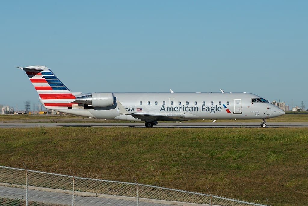
These small jets are used to connect small airports to main hubs, and this brings back what we said in part 1, where we found out that small distances are the worst.
Now that our analysis about big polluters is over, we want to know who are the heroes of aviation, the ones that allow people to travel without polluting too much.
Small polluters
Again, our criteria for an airline to be a “small polluter” is arbitrary. We chose the following treshold : less than 5.55 kg/100km of CO2 per seat. Let’s break the suspense, here is a list of the small polluters among the biggest airlines:
| GoAir |
5.164 |
| Viva Aerobus |
5.304 |
| Frontier Airlines |
5.336 |
| IndiGo |
5.347 |
| Loong Air |
5.377 |
| AirAsia |
5.403 |
| Vistara |
5.414 |
| VietJetAir |
5.433 |
| Interjet |
5.436 |
| Volaris |
5.460 |
| Pegasus |
5.468 |
| Thai AirAsia |
5.479 |
| Vietnam Airlines |
5.482 |
| Citilink |
5.489 |
| Vueling |
5.520 |
| Spring Airlines |
5.525 |
| Wizz Air |
5.535 |
| Air Arabia |
5.532 |
From looking at this list, we can see that most of them are low cost airlines. This could be explained by the fact that low cost airlines tend to squeeze more seats into an aircraft and will reduce what is included with the flight, which would probably reduce the total mass of the plane. This question would require further research, and we will discuss it at the end of our analysis.
Let’s look at what aircraft are mostly flown by the airlines in our small polluter list.
We can see that this is mostly recent aircraft which, as said in part one, pollute less. The Neo and Max family at Airbus and Boeing respectively are the newest kind of aircraft that are being produced.
If our statement about more recent airplanes polluting less is true, what about the sector of those less pollutant aircraft ?
From the graph above we can see that the aircraft that is the most flown by the small polluters has a range of less than 3000km. Except for two of the aircraft (which are not used that much), they all lay within the “optimal” range found in part 1. That makes us happy (:
Finally, let’s compare the sector of aircraft operated by big polluters and the sector of aircraft operated by small polluters.
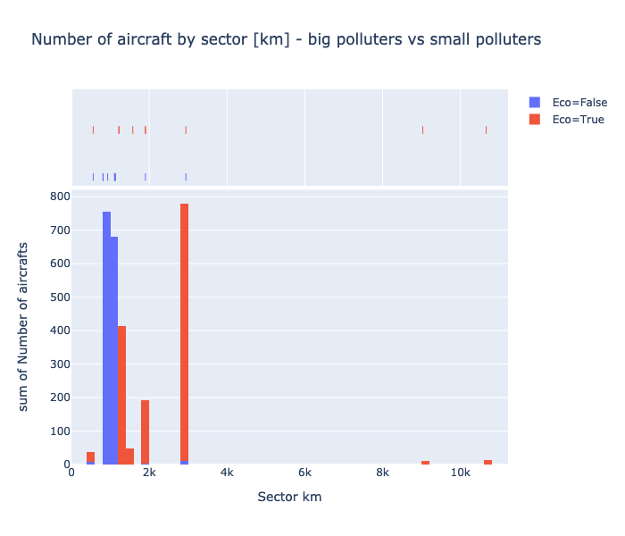
We can see from the histogram above that airlines that are polluting less are operating flights with aircraft that are designed to fly further.
We can conclude from this analysis that we have found significant differences between regional airlines and low cost airlines. Flying with a low cost airline will most likely reduce your CO2 emissions per kilometer compared to fly with a regional jet. The reason of being of these two types of flights is entirely different. The purpose of regional flights is to allow passengers to stop over in one of the main hubs of the airline before continuing on with another flight. So these flights can be more expensive (burn more fuel) than flights operated by a low cost airline.
Low cost are on the other hand trying to minimize their operating costs. Since fuel expenses represent approximately 25% of their operating costs (according to https://www.statista.com/statistics/591285/aviation-industry-fuel-cost/), low cost airlines have a large interest in operating fleets of aircraft that burn less fuel.
We would like to thank Planespotters and Gapminder for providing us the datasets that this research required.
10.99 kg/100km
Average CO2 emissions by seat of Air Wisconsin
Boeing A220-300
Least widely-used pollutant aircraft
5.16 kg/100km
Average CO2 emissions by seat of GoAir
Bombardier CRJ-100
Most widely-used pollutant aircraft
CHAPTER 3
A little bit of geography
So far we took into account the distance, the type of aircraft and the airlines. One logic way to expand our analysis is to see what that represents in terms of countries.
However, we noticed that the USA and China have a lot more airplanes than the others (trust us, we ensured that these two huge numbers were not due to a data cleaning error or bad data).
Indeed after a bit of Googling we realized that, for example, Americain Airlines is the largest airline in the world with a huge fleet and there are some really big carriers in those countries.
For the sake of visibility, we decided to remove these two countries from our data for this part.
Let's then see the rest of the world without them:
This plot seems to be quite representative, but there are some countries with too few airplanes. For example Botswana only has one aircraft. So our datasets do not cover all countries, we decided to put a threshold of 20 aircraft and drop the countries that are below.
Now, we can plot the average CO2 emissions per seat for 100 km for each of the remaining countries.
This representation allows us to see where the other larger players in the aviation market are. Nevertheless, it is hard to see any trend between the number of planes and the CO2 that it is emitted per seat.
We continued our analysis looking at a linear model for this, and would have loved to share a successful result with you,
but we concluded that there is no linear model that will explain the link between CO2 per seat (kg/100 km) and the number of planes a country has.
However, we can continue our analysis and try to find a factor between countries and average CO2 per seat (kg/100 km). So let's plot it on a map.
What does this maps show us ? One first limitation is that we do not have enough data for the African continent. But even excluding Africans countries, we can observe that Western countries (ie: USA, Canada, European countries) pollute more than the rest of the world. To explain that we can state two hypothesis:
- Higher income allow people to travel more short distances
- Poorer countries probably do not have a lot of internals flights
Let's take the first one and show it in a map ploting the income by person:
The map looks good and we can say that our first hypothesis seems to be true.
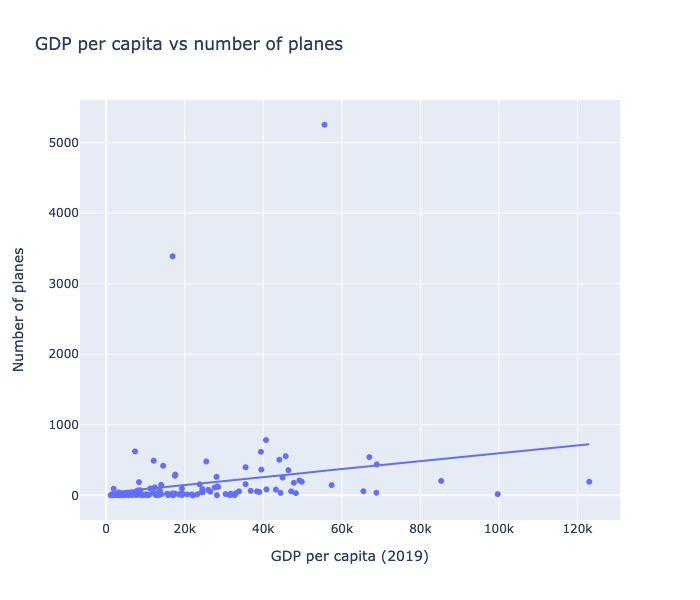
However, we were once again not able to show that the higher the GDP per capita is, the more a flight pollutes per seat with a linear regression.
To go further, we tried a regression between the number of planes and and the GPD per capita. In that case, we can say that the trend, Countries with higher GDP per capita tend to have more airplanes, is statistically relevant.
We found several things in this chapter. First, there are big differences between countries in terms of number of airplanes and consequently air traffic. Secondly, there is indeed a group of rich countries that pollute more. That could be obvious things but here we have numbers and statistics to show that.
5253
Number of planes of the USA
3388
Number of planes of China
13988
Number of planes of the rest of the world
CHAPTER 4
Home Swiss home
The last aspect that we want to explore with you are the flight routes. As we are based in Switzerland, we take into account only the flight routes from Swiss airports.
We will start with the long distance routes, in other words the ones that go outside of the Europe.
As in the previous chapter, the outliers would affect the visibility on our graphs. This is why we removed them as well.
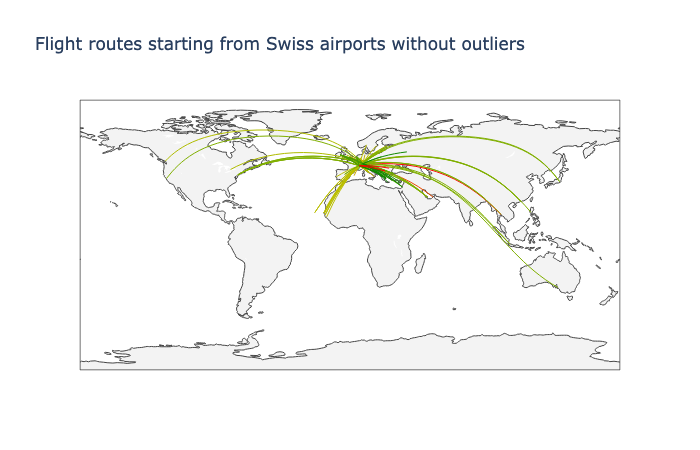
We can observe from the map above that flights that are not long hauls will have better CO2 emissions per seat than the long hauls that cross the Atlantic, or Asia. This confirms that flights that fly longer distances will pollute more per kilometer.
Let's now have a look at the European situation. We plot the less polluting routes by km from Switzerland to EU countries and we directly remove the outliers which remain the same.

We can see from the graph above that shorter flights tend to use more fuel. This confirms the findings done in the first analysis where it was found that CO2 emissions per seat decrease rapidly when aircraft increase their flight distance up until 6000 km. It is then not a surprise to see the longer flights on this map having higher CO2 emissions per seat.
Another element we can see on this plot is that there is better destination to go for if you care about the environment even for similar distances. In fact, we see a broad range of colors for distances which are similar.
WHAT DID WE LEARN?
Thank you for flying with us
Distance has an influence on the CO2 emissions per kilometer. Indeed, our first finding is that the ideal distance to travel is more than 2000km
as the CO2 emissions are higher for shorter flights.
You might then be thinking that it is ridiculous to fly short distances on board of small regional aircraft, but
flying these short routes is essential for airlines to allow them to fill up the big ones (long hauls), that are flying the large distances. Indeed, most airports do not have enough traffic to make long haul flights financially interesting, therefore they will only have a few regional flights to bring passengers to larger hubs.
We cannot back up the claim, airlines protect this information since it would give other airlines insight in their operations.
Airlines today are opening flights to more destinations with smaller (long-haul) aircraft, allowing more customers to fly without stopover. The best sign that is pointing towards this trend is the failure of airlines to adopt the A380, a large aircraft designed to carry hundreds of more passengers than other aircraft.
The type of aircraft is also an important factor, especially since companies "choose" the planes they fly and how to configure the cabin. For example, low cost companies have better CO2 emissions per seat, as they try to put as many people as possible in an aircraft. So, should we prefer low cost airlines to improve our environmental footprint?
We think that it could be a good idea. However, given how complicated the aviation industry is, we are not convinced that taking into account only CO2 emisions is a broad enough approach to grasp the economical and enviromental impact of low cost airlines.
Let's end this story on a positive note: there is hope on the horizon.
Thanks to improvements in engines and building materials, aircraft have consistently been reducing their emisions.
We can also see big differences in the different parts of the world.
As Europeans, we can really have an impact on the CO2 emissions of the aviation industry.
We did not discuss the alternatives to flying such as trains or buses. Indeed, comparing our data to other means of transportation is complicated, as data for these other means of transportation are hard to come by. Making a general analysis was then not feasible during this project.
Thank you for following us during this journey, and we hope that you have learned something interesting.
CONTACT US
We'd love your feedback!
DATA SOURCE
We want to give credit where credit is due!
This research would not have been possible without:
Bringing up OpenSky: A large-scale ADS-B sensor network for research
Matthias Schäfer, Martin Strohmeier, Vincent Lenders, Ivan Martinovic, Matthias Wilhelm
ACM/IEEE International Conference on Information Processing in Sensor Networks, April 2014
Wikipedia
OpenFlights
PlaneSpotters
Gapminder